Statistical Table Design Handbook
This guide is the thick reference layer for the statistical table design work now carried into Dataface.
Use it to keep the doctrine, caveats, image evidence, and source distinctions together. For the copied image package and provenance metadata, see statistical-table-design-assets/manifest.json.
How To Use This Guide
This is not a flat checklist. It is a synthesis of historical and modern table-design research adapted for Dataface.
The source spine is:
- William S. Cleveland on exact lookup, scanning, interpolation, and matching
- Karl G. Karsten on stubs, headings, tabulations, worksheets, and totals
- Alberto Cairo on the table-versus-chart decision
- Lisa Charlotte Muth on modern digital table practice
- Jonathan A. Schwabish on headers, spanners, dividers, borders, whitespace, and alignment
Inline attributions name the author and year when the year is available in the research layer.
Glossary
table architecture: the structural arrangement that makes a table readable as a system rather than a pile of cellsstub: the side label area, usually carrying the dominant row categoriesclassified stub: a multi-level row-grouping structurecolumn heading: the label at the top of a columnspanner head: a heading that spans multiple columnsspanner rule: the line associated with a spanning headerrule: a separator line used to distinguish structural transitionsborder: the outer edge around a tablegridline: an internal cell-separating linefooter: the bottom area where totals, averages, or summary rows may appeartabulation: a structured arrangement of datawork-sheet: a proto-table or analytic matrix used to structure and check data before final display
1. What Tables Are For
Statistical tables are strongest when the reader needs exact values rather than an overall visual impression. Cleveland (1985) separates table look-up from pattern perception, and Cairo reaches the same practical conclusion in modern terms: when the task is to identify each individual value, a table is often the strongest form.
This is the central doctrinal point for Dataface too. A table is not a failed chart. It is a distinct reading instrument optimized for exact retrieval, orderly comparison, and dependable reference.
The important limit is that this is a task-fit rule, not an anti-chart rule. Charts remain stronger for patterns, relationships, anomalies, and distribution shape.
2. The Core Reader Tasks
Cleveland (1985) gives the clearest operational model of table reading: scanning, interpolation, and matching.
Scanning: finding the right row, column, label, or keyInterpolation: estimating position between labeled values when the display does not state the exact number immediatelyMatching: connecting a symbol, label, or category in one place to its explanation in another
This is a better design frame than generic words like readability or cleanliness. A good table reduces search friction, back-and-forth eye travel, and memory burden. A bad one forces the reader to reconstruct the lookup path every time.
That is also why more scaffold is not automatically better. Cleveland's research helps explain why some grids and guide structures help pattern comparison without improving exact lookup.
3. Rows, Columns, Stubs, And Headings
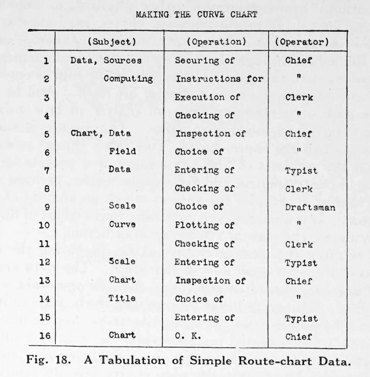
Karsten is the strongest source in this corpus for formal table structure. His work treats stubs, headings, tabulations, and totals as designed parts, not as typographic afterthoughts.
The key structural rule is that row and column assignment is semantic. The more important grouping series often belongs at the side edge, and the longer series is often better listed downward. That means the stub is not leftover margin space. It is often the right home for the dominant grouping variable because it supports scanning and preserves group structure.
Karsten also makes it clear that grouped headings and classified stubs are part of the table's logic. They are not mere decoration.
4. Tables As Reasoning Surfaces
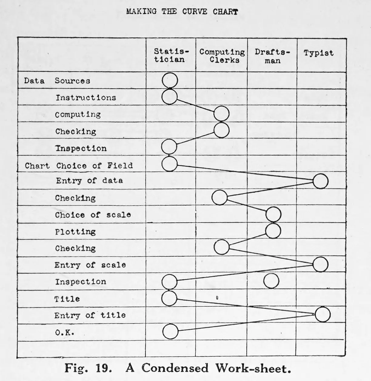
Karsten's worksheets broaden the meaning of table design. Tables are not only publication outputs. They are also working structures for sorting, condensing, sequencing, and checking information before final presentation.
That matters for Dataface because many table-design problems begin before styling. A table can fail because the grouping logic is weak, the row-column assignment is unhelpful, or the data shape is fighting the intended lookup task.
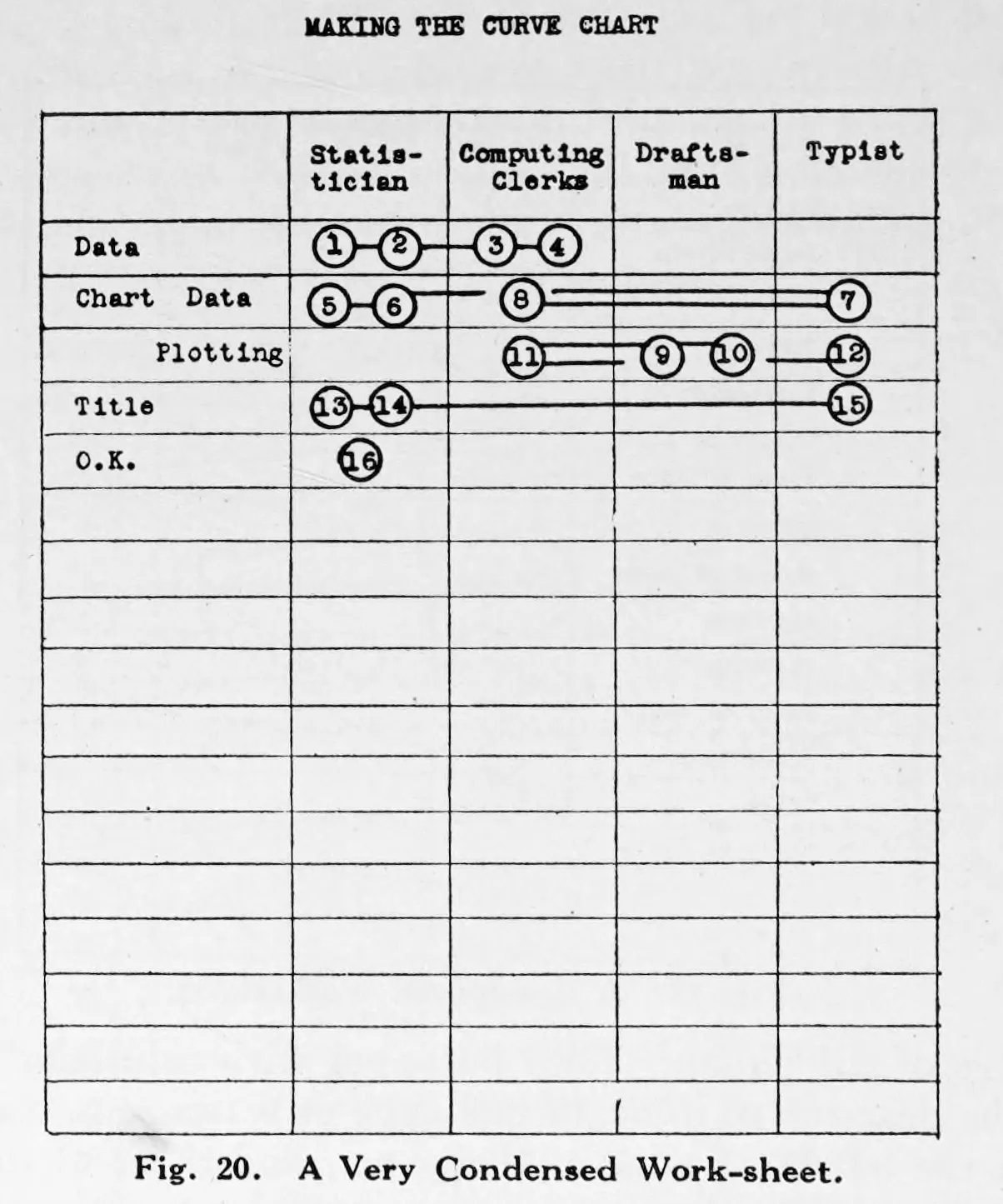
This historical material feels modern because spreadsheet work, pivoting, and intermediate summary tables still operate on the same logic.
5. Totals, Subtotals, And Aggregation
Totals and subtotals should be treated as structural guides, not merely as appended arithmetic. Karsten treats the placement of totals as a design problem, and Muth (2018) shows the modern workflow equivalent through pivot tables and grouped summaries.
The design implication is simple: totals should appear where the reader can understand what they summarize without hunting for context. Aggregate rows and footer rows are part of the table's navigation system.
6. Rules, Borders, Spanners, And Whitespace
This is where table purpose becomes table architecture.
The strongest safe synthesis is:
- prefer selective rules over full boxing in finished tables
- use lines where they clarify major transitions such as header-to-body, grouped-column boundaries, or footer separation
- use denser grids mainly for worksheet-like reasoning surfaces
- use grouped headers and spanners when they reduce repetition and clarify column families
- let whitespace do real grouping work instead of relying on heavy gridlines everywhere
Karsten gives the structural doctrine. Schwabish (2020) gives the clearest modern operational language for spanner heads, spanner rules, subtle dividers, optional borders, differentiated footer rows, and spacing.
The evidence here is strong enough to support selective-rule guidance, but not strong enough to pretend we have a complete doctrine for double rules or every fine publication-style line hierarchy. That uncertainty should stay visible.
7. Alignment Should Follow Task And Semantic Role
The best-supported rule is not left-align everything or center the headers. Alignment should follow the reader's task and the semantic role of the text.
The most useful breakdown is four separate alignment problems:
Stub alignmentRow labels, category names, and longer text usually want a stable reading edge. In left-to-right contexts, that usually means left alignment.Numeric alignmentNumbers are comparison-aligned rather than ornamentally right-aligned. Decimal alignment is best when precision comparison matters. Right alignment is the practical fallback when richer layout controls are unavailable.Header alignmentOrdinary one-column headers usually work best when they inherit the logic of the thing they label. This is a weaker doctrine than the others, so the uncertainty should remain visible.Grouping alignmentSpanners and grouped headers often need centering because they label a region of the table rather than a single stream of entries.
This yields a useful Dataface default:
- left-align text columns and row labels in LTR contexts
- decimal-align numeric columns when possible
- otherwise right-align numeric columns
- align ordinary one-column headers with the content beneath them
- center spanners and grouped headers
The ambiguity matters. The evidence does not support a universal law that ordinary one-column headers must always be centered or that centered single-column headers are always wrong. The best-supported default is narrower: single-column headers should usually align with the content they govern.
If space becomes too tight for those alignments to work cleanly, Muth's modern examples suggest a better response than forcing awkward alignment: redesign the header architecture first.
8. Data Shape Is Part Of Table Design
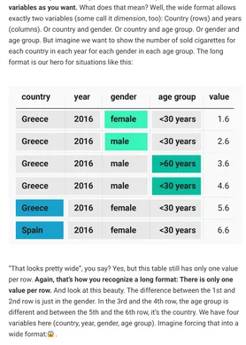
Muth's table work makes visible something older authors do not name directly: many table failures begin before any styling choice. Long-versus-wide arrangement, pivoting, grouped summaries, and workflow preparation all shape what kinds of tables can be made and how usable they will be.
That means table design in Dataface includes deciding whether the data structure supports the intended lookup task before debating borders, alignment, or spacing.
9. Modern Table Hybrids
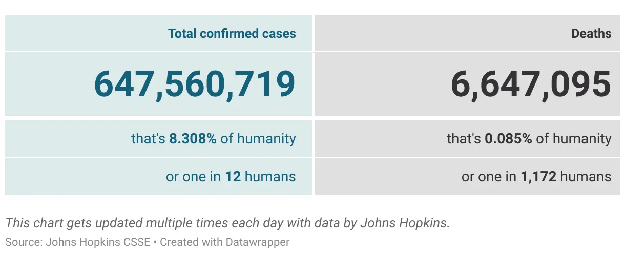
Contemporary table practice includes searchable tables, heatmap tables, icons, and other small visual enrichments. The important limit from the research is that these devices should support lookup, not replace it.
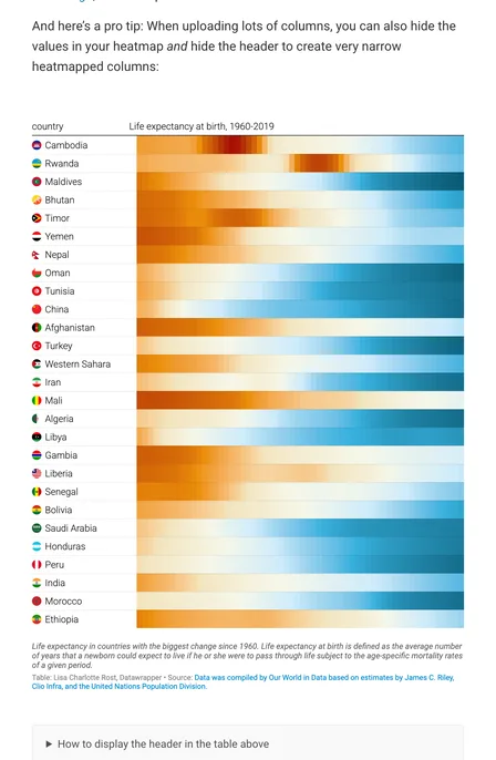
Add visual reinforcement when it strengthens scanning, grouping, or light comparison inside an intact table logic. If the visual encoding becomes the main reading channel, the display may no longer be functioning as a table.
10. Tables And Charts Often Need To Travel Together
The table-versus-chart question is often framed as a winner-take-all decision. The research points to a better answer: many tasks require both.
Cairo argues that tables are strongest for exact values while charts reveal patterns and exceptions. Cleveland's work explains why: exact lookup and pattern perception are genuinely different tasks. A mature Dataface view may therefore be strongest when the chart and the table travel together rather than competing for the same role.
Use charts for global structure and tables for auditing, reference, or value-by-value reading. When both exactness and overview matter, pairing is often the most honest pattern.
Practical Defaults For Dataface
- Prefer tables when exact value retrieval is the primary task.
- Design tables around scanning, matching, and interpolation rather than generic neatness.
- Treat row and column assignment as semantic.
- Treat totals and subtotals as structural guides.
- Use selective rules and whitespace as quiet scaffolding.
- Use spanners to label regions, not individual reading streams.
- Align text, numbers, headers, and grouped heads according to their distinct roles.
- Treat data shape as part of table design, not a separate preprocessing concern.
- Use modern table enrichments only when they preserve lookup and scanability.
- Pair charts and tables when readers need both overview and exact reference.