Themes & Styling
Control the visual appearance of your dashboard globally or per-chart.
For the implementation-backed inventory of single-chart properties, see the YAML Schema Reference. This page explains how that chart property surface relates to reusable themes and style presets.
For the current design-direction note behind Dataface's neutral frame colors, including why the product is exploring near-black ink and an off-white app canvas, see Tonal Foundations.
For the DFT-specific chart palette direction, including the full catalog of shipped palettes with visible swatch previews, see Palettes.
Themes
Dataface includes 18+ built-in themes that apply consistent styling across your entire dashboard. Built-ins live in dataface/src/dataface/core/defaults/themes/, one file per theme. Project-specific themes are face files under faces/ in your project (see Custom Themes).
Internally, Dataface separates:
- Theme = CSS-like painting of the chart scaffold
- Style Preset = HTML-like chart scaffold
- Chart = per-chart authored meaning, field bindings, and one-off framing
That means fonts, colors, surfaces, palette choices, stroke/fill, widths, and sizes belong in themes, while defaults like axis side, grid/domain presence, legend side, title anchoring, and other scaffold decisions belong in style presets. Field bindings and chart-specific meaning stay chart-authored.
The runtime merge order is: base vega.config -> selected theme.
Ownership Model
The chart property catalog uses a four-bucket ownership model:
- Chart: chart-authored by default
- Style Preset: reusable scaffold/default-layout behavior
- Theme: reusable visual styling default
- None: intentionally kept out of reusable preset/theme ownership
This means the catalog is the full property inventory, while themes and style presets are assignment layers over that inventory.
Examples:
x,y,color,theta, andlinkare chart-owned- axis label angle, legend placement, grid/domain presence, and header wrapping are preset-owned defaults
- background fills, palettes, mark color/stroke styling, and spark/bar paint surfaces are theme-owned defaults
- compatibility surfaces such as
seriesshould stay out of both
Using a Theme
Add theme: at the top level of your dashboard:
title: "Sales Dashboard"
theme: dark

queries:
  sales: SELECT * FROM sales

layout:
  - revenue_chart
Available Themes
| Theme | Description | Background |
|---|---|---|
light |
Clean default theme | White |
dark |
Dark mode with blue-gray tones | Dark blue-gray |
editorial |
Serif typography, gray scaffold | White |
editorial-cream |
Editorial with a cream background | Cream |
bi |
Business intelligence styling | White |
carbong100 |
IBM Carbon (darkest) | #161616 |
Theme Examples
Dark Theme:
title: "Analytics Dashboard"
theme: dark

layout:
  - daily_metrics
  - revenue_breakdown
Editorial Cream Theme:
title: "Quarterly Report"
theme: editorial-cream

layout:
  - revenue_chart
What Themes Control
Themes automatically style:
- ✅ Dashboard background - Overall page background color
- ✅ Chart colors - Bars, lines, areas, points
- ✅ Axis styling - Grid lines, labels, titles
- ✅ Tables - Header backgrounds, borders, stripes
- ✅ Variables - Input backgrounds, borders, labels
- ✅ Titles - Text color and contrast
In catalog terms, themes are the default owner for properties such as:
style.backgroundstyle.color_scheme- visual
mark.*leaves such as color, fill, stroke, opacity, and stroke width - spark and
spark_barpaint surfaces such asstyle.spark_bar.bar.color,style.spark_bar.bar.background,SparkConfig.color, andSparkConfig.background
Themes should not be the primary home for chart scaffolding defaults. If you find yourself deciding where an axis sits or whether grids/domains are shown by default, that belongs in a style preset instead.
More precisely:
- theme answers how the scaffold is painted
- style preset answers what scaffold exists and where it sits
- chart answers what this specific chart means and how it binds data
Title overflow is a style-owned scaffold behavior. Use style.title.overflow
to choose between clip, truncate, wrap-two, and wrap. The default is
wrap-two. clip hard-cuts text, truncate adds an ellipsis, wrap-two
wraps to two lines and ellipsizes the second line when needed, and wrap
fully wraps. The same setting applies to Vega-Lite, table, and KPI chart
titles.
For tables, header labels inherit the chart title overflow mode by default.
You can override that with style.header_overflow for the whole table or
style.columns[].header_overflow for a specific column.
Custom Themes
A custom theme is a face file under faces/ in your project — typically an
underscore-prefixed file to mark it as a non-listable building block. Use
extends: to inherit from a built-in theme and override only what changes:
# faces/_my-brand.yaml
extends: light
style:
  background: "#f8f9fa"
  accent: "#3498db"
  charts:
    palette: my-palette
Reference it from any face via a path ref (anchored to that face's directory):
# faces/my-dashboard.yaml
extends:
  - light          # theme name first (lower priority)
  - ./_my-brand.yaml  # custom face last (higher priority — its overrides win)
Put the theme name first so the custom face's style overrides win. The engine resolves the last recognised theme name in the list for palette and paint defaults, then applies each extends entry in order (later = higher priority).
See examples/playground/faces/composition/ for a complete working example.
Vega-Lite Config Overrides
vega.config in dataface.yml lets you set project-wide Vega-Lite config defaults.
Dataface uses a closed contract for supported keys — see VegaLiteConfig in the source.
# dataface.yml
vega:
  config:
    header:
      labelFontSize: 12
      titleFontSize: 13
defaults/themes/editorial.yaml ships with Dataface's default chart house style;
the engine maps it to a Vega-Lite config via style_to_vega_lite() at render time.
Custom Themes
Custom themes are face files under faces/ in your project — conventionally
underscore-prefixed so they are non-listable building blocks. Use extends:
to base a new theme on a built-in one and override only what changes:
# faces/_newsroom.yaml
extends: light
style:
  charts:
    palette: newsroom-palette
    bar:
      fill: "#1d4ed8"
Reference it from any face with a path ref. Put the built-in theme name first so the custom face's overrides win:
# faces/my-dashboard.yaml
extends:
  - light           # built-in theme (lower priority)
  - ./_newsroom.yaml  # custom face (higher priority)
Global Styling
Set styling options for the entire dashboard using style: at the face root. The most commonly authored face-level style keys are:
style:
  background: "#f5f5f5"    # Working-surface background color
  font:
    family: "Inter"        # Font family name
    emoji: monochrome      # Emoji rendering mode
  formats:
    currency: "$,.0f"      # Format alias map (overrides theme defaults)
  charts:
    axis:
      grid:
        visible: true      # Chart-level axis grid default
For the full inventory of face-level style: keys, see the YAML Schema Reference. The top-level style: block is typed as StylePatch — all fields are optional, and they cascade on top of the selected theme. Commonly used top-level keys include background, font, formats, palettes, roles, charts, layout, variables, board, title, text, border, accent, and muted.
Properties like palette, axis, legend, backgrounds, and css (which appeared in older examples) are not valid at the face style: root.
Style Options
background: Working-surface background color (hex, rgb, name, or "transparent")font.family: Font family namefont.emoji: Emoji rendering mode (monochrome,color,system-default,disabled)formats: Format alias map (see Format aliases)charts.*: Chart-type style tree — grid, legends, palettes per chart (see Chart-Level Styling)palettes: Theme palette role assignments (open dict: role name → palette file name)
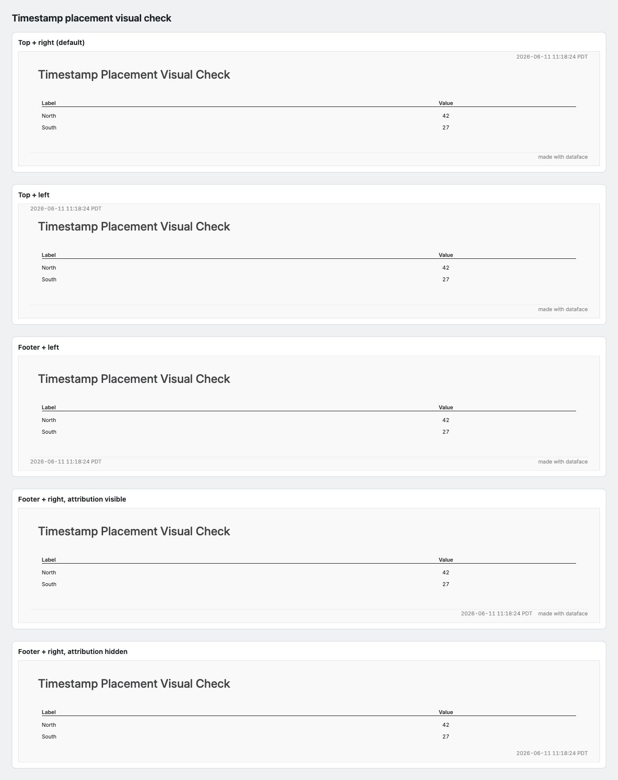
Timestamp placement
Dataface renders a timestamp by default in the top-right page chrome. Use
style.timestamp.position to move it between the top row and the footer
baseline, and style.timestamp.align to choose the left or right edge of that
row. The default is position: top and align: right.
style:
  timestamp:
    position: footer
    align: left
When the timestamp is right-aligned on the footer baseline, Dataface keeps the footer attribution on the far right and shifts the timestamp left so the two strings do not overlap. If the footer is hidden, a footer-right timestamp uses the right page edge.
Markdown text styling
Markdown prose in a text: block — body copy, inline `code` and fenced code
blocks, and > blockquotes — is painted from the theme, so it tracks the active
theme and accent automatically. Body text uses style.text.font; headings use
style.title.font; links use style.accent. Inline code, fenced code, and
blockquotes have their own box style groups under style.text, with the same
font / background / border shape used by chart cards and callouts:
style:
  text:
    code:                 # inline + fenced code
      font:
        family: "ui-monospace, SFMono-Regular, Menlo, monospace"
        color: "#222222"
      background: "#f3f4f6"   # code surface fill
      border:
        color: "#e5e7eb"      # code box border
        width: 1
        radius: 4             # rounded code chips / blocks
    blockquote:           # > blockquote
      font:
        color: "#5f6b7a"      # muted quote text
        style: italic
      background: "#f9fafb"   # blockquote surface fill
      border:
        color: "#3b82f6"      # left rule (the theme accent by default)
        width: 3
        radius: 0
font accepts the full font overlay (family, color, size, weight, style,
decoration, case); border is the standard width / color / radius group.
Every key is optional in a face style: — set just the leaf you want to change (for
example style.text.code.background to recolor code chips for one dashboard). The
built-in dark theme ships darker code/blockquote surfaces; custom themes set these
in theme YAML so all dashboards inherit them.
The font overlay is fully honored for code and blockquote prose — family, color,
size, weight, style (italic), and decoration (underline / line-through) all
render. case supports upper and lower; the richer transforms (title, sentence,
slug, camel) are rejected on markdown prose rather than silently ignored.
Emoji handling
Themes control how emoji codepoints render via style.font.emoji. This field
is required — the theme YAML must set it explicitly (no in-code default).
The stark base theme sets emoji: monochrome; all built-in themes
inherit this via extends: unless they override it.
| Value | HTML surfaces | SVG / PNG via vl-convert | PDF via ReportLab |
|---|---|---|---|
monochrome (default) |
Bundled Noto Emoji — deterministic monochrome | Bundled Noto Emoji — same glyphs as HTML | Bundled Noto Emoji on single-emoji runs; mixed-text emoji still gapped |
color |
Bundled Noto Color Emoji — deterministic full-color | Bundled Noto Color Emoji (COLRv1, requires Resvg ≥ 0.27; verified at build time) | Bundled Noto Color Emoji on single-emoji runs; mixed-text emoji still gapped |
system-default |
OS color emoji wins (Apple Color, Segoe UI Emoji, Noto Color Emoji) | No emoji font registered — emoji codepoints render as missing glyphs | Missing glyphs |
disabled |
OS color emoji wins (no Dataface emoji wiring) | Missing glyphs; no @font-face partial shipped |
Missing glyphs |
# Default: Dataface's editorial monochrome — same glyphs everywhere
style:
  font:
    emoji: monochrome
# Standard recognizable color emoji (deterministic across HTML / SVG / PNG)
# Adds ~1.7 MB Noto Color Emoji woff2 to browser payloads.
style:
  font:
    emoji: color
# Let the browser pick OS-native color emoji (HTML-only; SVG/PNG degrade)
style:
  font:
    emoji: system-default
# No Dataface emoji wiring at all
style:
  font:
    emoji: disabled
Note: system-default and disabled intentionally degrade on SVG/PNG/PDF
surfaces — there is no OS fallback on those renderers. Use monochrome or
color when cross-surface emoji parity matters.
The color mode ships an additional ~1.7 MB Noto Color Emoji woff2 to browser
clients (served with font-display: swap so the cost is paid lazily and cached
after the first emoji render).
CSS Scope & Limitations
The style.css file styles the Dashboard Shell (HTML), but has limitations regarding internal Chart elements (SVG).
What CSS Can Style (HTML)
- Layout: Rows, columns, grids, margins.
- Typography: Section titles, markdown text, KPI cards, headers.
- Interactive Elements: Filter inputs, buttons, tabs.
- Backgrounds: Page background, section borders, shadows.
What CSS Cannot Style (Charts)
- Chart Internals: Bars, lines, axes, legends inside the Vega-Lite charts.
- PDF Exports: Static exports use a different rendering path where external CSS may not apply fully.
Recommendation:
- Use Style Options (style.palette, chart.style) for chart colors and axes.
- Use Custom CSS for layout, typography, and branding of the surrounding page.
Chart-Level Styling
Override theme for specific charts:
charts:
  custom_chart:
    title: "Custom Styled Chart"
    query: queries.sales
    type: bar
    x: month
    y: total_revenue
    style:
      palette: "viridis"          # Different color scheme
      legend:
        visible: true             # Show legend (default)
      axis:
        grid:
          visible: false           # Hide grid lines
Style Options
Color Palettes
Choose from built-in color palettes:
category10- Default categorical palette (10 colors)viridis- Perceptually uniform sequential paletteblues- Blue sequential palettereds- Red sequential palettegreens- Green sequential palettegrays- Grayscale palette
Choosing a palette:
- Categorical data: Use category10 or other categorical palettes
- Sequential data: Use viridis, blues, reds, greens
- Accessibility: Consider colorblind-friendly palettes
DFT Palette Direction
Alongside the generic built-in schemes above, DFT now documents its own chart-library palette direction:
- the default DFT categorical palette is a blue-first ten-color set tuned for calm, editorial multi-series charts
- single-series charts (one mark, no color encoding) inherit the active theme's single-series ink — e.g. dark blue on editorial, warm dark brown on cream — instead of falling back to the categorical palette's anchor
hero-6is a hero-blue-versus-neutrals palette for charts where one series should dominate
See Palettes for the full catalog with swatch previews.
Legend
Control legend display per chart (within a chart's style: block):
charts:
  my_chart:
    type: bar
    style:
      legend:
        visible: false  # Hide legend
Hide just the legend title while keeping the color swatches with
title.visible: false — useful for a top horizontal legend where the title
is redundant:
charts:
  my_chart:
    type: bar
    style:
      legend:
        position: top
        direction: horizontal
        title:
          visible: false   # hide the legend title, keep the swatches
Grid Lines
Show or hide grid lines per chart (within a chart's style: block):
charts:
  my_chart:
    type: bar
    style:
      axis:
        grid:
          visible: true    # Show grid lines
          # visible: false  # Hide grid lines
Ratio-percent line and area charts automatically emphasize the unity baseline
at y=1 when the effective y-domain includes that value. This is the common
100% guide for retention, conversion rate, and NRR charts stored as ratios
such as 1.08. Style the rule with the existing axis_y.grid.zero color and
width settings:
charts:
  nrr:
    type: line
    style:
      number_format: percent_whole
      axis_y:
        scale:
          domain: [0.95, 1.2]
        grid:
          zero:
            width: 3
Axis Labels
Hide axis labels with label.visible: false:
style:
  axis_y:
    label:
      visible: false   # hide y-axis labels entirely
This matches the existing convention for other axis elements (grid.visible, domain.visible, ticks.visible).
Label density
Three knobs control how densely labels are packed on an axis:
label.overlap — strategy for thinning overlapping labels. Four named values:
"smart"(default) — Dataface omitslabelOverlapfrom the compiled Vega-Lite spec, which triggers VL's per-scale adaptive default: parity for non-log continuous scales, greedy for log scales, none for nominal/ordinal. This is the most context-aware option."parity"— force every-other-label drop on any scale type."greedy"— force left-to-right drop on any scale type."allow"— no overlap reduction; every tick label is rendered even if labels overlap.
Raw true or false are rejected — use the named string equivalents.
label.separation — minimum pixel gap between adjacent label bounding boxes before they count as non-overlapping (default 16). Only active when overlap resolution is on. Raise it to add visible breathing room between retained labels.
label.max_width — maximum pixel width before a label is truncated with … (Vega-Lite default 180px). Tighten for narrow charts; loosen for charts with long category names.
style:
  axis_x:
    label:
      overlap: "parity"  # every-other-label drop on any scale
      separation: 24     # extra breathing room
      max_width: 120     # truncate at 120px
Positioning and boundary
Five knobs control where a label sits relative to its tick and whether it survives clipping at the axis range edges.
bound — hide labels whose bounding boxes overflow the axis range.
Reach for it when a categorical x-axis has one very long label at the first or
last position that bleeds into the chart padding or off the canvas. Accepts
true (hide any overflow) or a pixel tolerance (hide only when overflow exceeds
that many pixels).
charts:
  product_revenue:
    type: bar
    x: product_name     # categorical, some labels very long
    y: revenue
    style:
      axis_x:
        label:
          bound: true   # hide labels that bleed past chart edge
flush — align the first and last labels flush with the scale range rather
than centered on their tick.
Reach for it when time-series edge labels ("Jan 2022" / "Dec 2024") get clipped
at chart edges. Note: Vega-Lite defaults differ by axis — true for x, false
for y. Accepts true/false or a pixel tolerance (flush only when label
exceeds by more than that many pixels).
style:
  charts:
    axis_y:
      label:
        flush: true     # opt y-axis into flush alignment (VL default is false)
charts:
  monthly_revenue:
    type: line
    x: month
    y: revenue
    style:
      axis_x:
        label:
          flush: 4      # flush only if label exceeds scale edge by more than 4px
offset — pixel offset of the label from its anchor.
Reach for it when fine-grained nudging is needed — for example when
axis_x.offset shifts the axis line itself or when bar-band tick positioning
leaves labels misaligned with bar centers. Negative values move labels toward
the chart interior; positive toward the chart edge.
charts:
  weekly_signups:
    type: bar
    x: week
    y: signups
    style:
      axis_x:
        label:
          offset: -3    # nudge labels 3px toward chart interior
line_height — line height in pixels for multi-line labels.
Reach for it when label.expr returns an array of strings (multi-line labels).
The default is the label font size. Has no effect on single-line labels.
charts:
  monthly_metric:
    type: bar
    x: month
    y: metric
    style:
      axis_x:
        label:
          expr: "split(datum.label, ' ')"   # multi-line via labelExpr
          line_height: 14                     # 14px between lines
anchor — alignment of the label relative to its tick position ("start",
"middle", "end").
Different from align (the text-anchor of the label content). anchor is
where the label sits relative to the tick. Useful in two concrete cases:
(1) anchoring tilted labels to the right edge so the angled tilt visually
attaches to the tick, and (2) band-scale charts where labels should start at
the band edge rather than center.
charts:
  long_categories:
    type: bar
    x: state_name          # 50 nominal categories
    y: revenue
    style:
      axis_x:
        label:
          angle: -45
          anchor: end      # angled labels attach at their right edge to the tick
Format aliases (style.formats)
Format aliases map short names like currency or compact to D3 format
strings. They live in theme YAML — not in engine code — so project themes can
override or extend the vocabulary without touching Python.
Built-in aliases
| Alias | D3 spec | Example output |
|---|---|---|
currency |
$,.2f |
$1,234.57 |
currency_whole |
$,.0f |
$1,235 |
currency_compact |
$~s |
$1.2k |
percent |
.1% |
12.3% |
percent_whole |
.0% |
12% |
percent_delta |
+.1% |
+12.3% |
compact |
~s |
1.2k |
integer |
,.0f |
1,235 |
delta |
+,d |
+31 |
number |
,.2f |
1,234.57 |
date_short |
%-d %b %Y |
7 Mar 2024 |
percent, percent_whole, and percent_delta (and any raw d3 spec ending in
%) expect a 0–1 ratio — d3's % type multiplies by 100 itself, so
0.182 renders "18%" but 18.2 renders "1820%". If your SQL returns a
0–100-shaped value, divide by 100 before it reaches the chart (or a fix-it
error tells you to at render time).
Using aliases in charts
charts:
  revenue:
    type: bar
    x: month
    y: revenue
    style:
      number_format: currency    # resolves to "$,.2f" via theme cascade

  conversion:
    type: bar
    x: date
    y: rate
    style:
      number_format: percent     # resolves to ".1%" via theme cascade

  raw_d3:
    type: bar
    x: month
    y: amount
    style:
      number_format: "$,.0f"     # raw D3 spec — passes through unchanged
Defining custom aliases
Add style.formats at the theme or face level. Face keys override theme
keys; theme keys not redefined by a face propagate through unchanged.
In a theme YAML:
style:
  formats:
    currency: "$,.2f"
    revenue: "$~s"       # project-specific alias
    arr: "$,.0f"
In a face YAML (overrides theme for this face only):
style:
  formats:
    currency: "$,.0f"    # override theme's 2-decimal currency
Error contract
If an alias key is not defined in the theme cascade and is not a valid D3 format spec, D3 raises at render time. There is no code-side fallback table. This is intentional: the error points clearly at the theme that should define the alias.
Suppressing format with null
Use format: null (or omit format:) to suppress format emission and let
VL/D3 pick its own default based on the axis scale type. This is the
canonical way to override an inherited theme-level format: compact per
chart — no format: auto string sentinel.
Typography
Set the font family via the top-level style configuration:
style:
  font:
    family: "Inter"  # Font family name
Common font choices:
- Inter - Modern, readable sans-serif
- Roboto - Google's Material Design font
- Open Sans - Friendly, readable sans-serif
- Lato - Humanist sans-serif
Case
Every font slot supports a case field that applies a letter-case transform to
the text before it reaches SVG or Vega-Lite output. The default is none
(no transform).
| Value | Behavior |
|---|---|
none |
No transform (default). Text is rendered exactly as authored or returned from the database. |
title |
Chicago/Gruber-style title case. Lowercases stopwords (a, an, and, at, but, by, for, in, of, on, or, the, to, via, vs.). Always capitalizes the first and last word. Preserves any token containing internal capitals — ARR, MRR, iPhone, GitHub, SQL are untouched. |
sentence |
Uppercases the first letter; preserves all other characters as authored. Acronyms already capitalized by the author are preserved. |
upper |
All characters uppercased. |
lower |
All characters lowercased. |
slug |
Machine identifier form: spaces/hyphens → underscore, lowercased. Order Status → order_status. |
camel |
camelCase: first word lowercase, subsequent words capitalized. order status → orderStatus. |
Why smart title case matters
The case: title value uses the Gruber algorithm, not the naive "capitalize
every word" approach shipped by CSS text-transform: capitalize, Microsoft
Word, and most BI tools. The key rule: any token that already contains
internal capitals is left alone. This means metric initialisms common in
dashboards are safe:
ARR Growth by Segment         →  ARR Growth by Segment  (correct)
Revenue by Customer Segment   →  Revenue by Customer Segment
from the top                  →  From the Top
A naive every-word capitalizer would produce Arr Growth By Segment — editorial
garbage that damages brand credibility on published dashboards.
Setting case in a theme
Theme authors can enforce a casing convention across all text slots by adding
case: to the font block at whichever level they want it to take effect:
# In a theme YAML — title-case all chart titles, face titles, and KPI labels
title:
  font:
    case: title

charts:
  font:
    case: title
# In a face YAML — upper-case axis tick labels for this chart only
charts:
  pipeline_stages:
    type: bar
    x: stage
    y: count
    style:
      axis_x:
        label:
          font:
            case: upper
Scope and limitations
case applies to static authored text and data-derived static values:
- Face title and subtitle
- Chart title (as emitted in the Vega-Lite spec)
- KPI label text
- Table header display names
- Axis titles (as emitted in the Vega-Lite spec)
- Error and placeholder overlay text
For data-bound tick labels and legend item labels (rendered by Vega at
runtime from query results), only upper and lower are applied — they map
directly to Vega expression language (upper(datum.label),
lower(datum.label)). The title and sentence values have no equivalent in
Vega expression language, so they cannot be applied to data-bound labels at
render time.
Face markdown body text (text: blocks) is intentionally excluded — applying
case to Markdown would corrupt code spans, links, and emphasis markup.
Board-Level Styling
Apply CSS-like styles to any board or nested layout section:
rows:
  - title: "Styled Section"
    style:
      background: "#f0f4f8"
      border: "2px solid #667eea"
      border-radius: "8px"
      padding: "16px"
      color: "#333"
    cols:
      - my_chart
Supported Style Properties
| Property | Example | SVG | HTML | Description |
|---|---|---|---|---|
background |
"#f5f5f5" |
✅ | ✅ | Background color (hex, rgb, named) |
border |
"2px solid #ddd" |
✅ | ✅ | Border shorthand (width style color) |
border-radius |
"8px" |
✅ | ✅ | Corner rounding |
color |
"#333" |
✅ | ✅ | Text color |
padding |
"16px" |
✅ | ✅ | Inner spacing (affects content layout) |
margin |
"8px 16px" |
❌ | ✅ | Outer spacing |
gap |
"12px" |
✅ | ✅ | Override gap between child items |
Padding & Sizing
Padding is accounted for in layout calculations. When you add padding to a board:
- The board's children have less available space
- Content is properly inset from the border
- Height calculations include the padding
# Padding formats (CSS-style)
style:
  padding: "16px"           # All sides equal
  padding: "8px 16px"       # Vertical, horizontal
  padding: "8px 16px 12px"  # Top, horizontal, bottom
  padding: "8px 16px 12px 4px"  # Top, right, bottom, left
Border Styling
Borders support the CSS shorthand format:
style:
  border: "2px solid #667eea"  # width style color
  border-radius: "8px"         # Rounded corners
Example: Styled Cards
Create card-style sections with backgrounds and borders:
cols:
  - text: "### Success Card"
    style:
      background: "#c8e6c9"
      border: "2px solid #4caf50"
      border-radius: "12px"
      color: "#1b5e20"

  - text: "### Warning Card"
    style:
      background: "#fff3e0"
      border: "2px solid #ff9800"
      border-radius: "12px"
Layout Sizing
Automatic Sizing
Dataface automatically calculates sizes based on content:
- Charts: 300px default height (KPIs: 100px, Tables: 250px)
- Titles: Height based on font size and text length
- Markdown content: Height based on rendered text with word-wrapping
User-Specified Widths
In cols layouts, specify widths for individual items:
cols:
  - width: "30%"    # 30% of available width
    rows:
      - sidebar_chart
  - width: "70%"    # 70% of available width
    rows:
      - main_chart
Supported formats:
- Percentages: "30%", "70%"
- Pixels: "200px", "400px"
- Auto (default): Remaining space divided equally
Gap Control
Control spacing between items:
# Per-section gap override
rows:
  - title: "Compact Section"
    style:
      gap: "8px"  # Smaller gap between children
    cols:
      - a
      - b
Content-Aware Heights
Heights are calculated based on content type:
| Content Type | Default Height |
|---|---|
| Standard chart | 300px |
| KPI card | 100px |
| Table | 250px |
| Title | Based on text |
| Markdown | Based on rendered content |
In cols layouts, all items get the same height (maximum of their content heights) for proper alignment.
Number Formatting
Dataface uses d3-format spec strings everywhere numbers appear — chart axis labels, KPI tiles, and table cells all share the same format spec language.
Format spec syntax
The d3-format spec grammar is:
| Token | Meaning | Example |
|---|---|---|
fill |
Padding character (default space) | 0>10.2f |
align |
> right · < left · ^ center · = sign-then-pad |
<10.2f |
sign |
- minus-only · + always · ( parens negatives · |
+,.2f |
symbol |
$ currency prefix |
$,.2f |
0 |
Zero-pad to width | 06.2f |
width |
Minimum output width | 10.2f |
, |
Thousands separator | ,.2f |
.precision |
Decimal digits (or significant figures for s, g, r) |
.2f |
~ |
Trim trailing zeros and decimal point | .1~% |
type |
Format type — see table below | f |
Supported types (v1):
| Type | Description | Spec | Result |
|---|---|---|---|
f |
Fixed-point | ,.2f on 1234.56 |
1,234.56 |
% |
Percentage (×100 + %) | .1~% on 0.05 |
5% |
e |
Exponential | .2e on 1234.56 |
1.23e+3 |
s |
SI prefix | ~s on 1500000 |
1.5M |
g |
General (shorter of e/f) |
.3g on 0.001234 |
0.00123 |
r |
Rounded significant digits | .2r on 12.56 |
13 |
d |
Integer | d on 12.9 |
13 |
n |
Locale number (same as ,g) |
n on 1234 |
1,234 |
No-silent-drops contract. Any spec feature outside the v1 supported set raises D3FormatError with a position offset and a list of supported types. A bad spec in a theme or face raises at render time on the first row that uses it — not silently dropped.
B-for-billion divergence. Dataface's Python formatter (KPI tiles and table cells) maps the SI giga prefix G to B so that 1.5G displays as 1.5 B. Chart axes use real d3.js in the browser, which emits G. This is a deliberate Dataface extension. The ~s compact format rounds to 2 significant figures and uses k/M/B/T with a space separator in Dataface (vs k/M/G/T with no space in d3).
For the full d3-format reference see https://d3js.org/d3-format.
Numeric display conventions
Dataface's defaults for numeric display on dashboard surfaces. The d3 spec language above is the mechanism; the conventions below are the house style that governs which spec to reach for.
Prefer format aliases over raw d3 specs. Use currency_whole, currency, percent, percent_delta, integer, delta, compact from the theme cascade (Format aliases above). Raw d3 specs only when no alias fits — e.g. sub-1% percent precision needs ".2%". Raw specs work, but a face full of them drifts away from theme inheritance — a theme tweak won't carry through.
KPI support deltas without a glyph: use format: delta, not integer. format: integer (,.0f) drops the sign on positive values — a support value of +31 renders as bare 31, direction-blind. format: delta (+,d) forces the leading sign on positive values (d3 emits the minus sign on negatives either way). Reserve integer for values that are not deltas (counts, totals). When the KPI already carries a directional glyph (▲/▼ via style.glyph.character), the icon communicates direction and either format reads fine.
Currency: drop cents above $10. format: currency_whole ($,.0f) is the dashboard default. A value of $47.23 displays as $47 on dashboard surfaces; the cents add precision a reader doesn't use at a glance and crowd KPI rails and table columns. Reserve format: currency ($,.2f) for surfaces that demand reconciliation accuracy — billing breakdowns, financial statements, reports where exact match-to-source matters. Negative currency uses a minus prefix (-$1,234), not accounting parens.
Two notation families ship with the theme.
| Family | Form | Use for |
|---|---|---|
| Analytic | $2.5 M, space before suffix, uppercase K/M/B/T |
Dashboard chrome: axes, KPIs, dense tables, tooltips |
| Narrative | $2.5mn, no space, lowercase k/mn/bn/tr |
Prose surfaces: text cards, annotations, page/section/chart titles |
Theme choice (editorial-cream, carbong100, etc.) is visual identity. Notation family is independent — a narrative-feeling theme can still use analytic notation in its axes.
Precision is a group decision. The reader's context — a single headline KPI vs. a long table column — determines how much precision is tolerable as much as the value's magnitude does. Magnitude sets the default; surface modulates.
Default by magnitude:
| Range | Format | Examples |
|---|---|---|
| ≥ 20% | whole percent | 23%, 47%, 89% |
| 1–20% | one decimal (percent) |
1.2%, 8.7%, 12.5% |
| < 1% | two decimals (raw d3 ".2%") |
0.12%, 0.045% |
Modulate by surface. A single headline KPI or short rail (1–4 values) can afford one more decimal than the band default — there's nothing to scan against. A long table column or axis (>10 similar-magnitude values) is a real tradeoff: whole-percent aids scan-uniformity and distribution reading; the band default's precision aids close comparison across rows. The right call depends on the column's actual use — distribution scan favors the simpler form, close comparison favors keeping the decimal. Adjacent surfaces showing the same metric may format differently — a reconciliation table at .0% while its headline KPI shows .1%.
Meaningful-precision override. Some metrics carry signal in tenths of a percent regardless of magnitude or surface — A/B test conversion rates (4.27% vs 4.31% is a 1% relative lift), MoM churn at basis-point resolution, conversion rates in a tight range. For these, use ".2%" regardless of band. Precision is fundamentally a data-layer call — if the data carries signal in tenths or hundredths, the chart should show it.
Zero values strip trailing decimals — even when siblings have them. Render 0, $0, 0% — never 0.00, $0.00, 0.0%. A $0 KPI picks format: currency_whole even if its partner KPI uses format: currency for sub-dollar precision. The value is exactly zero; sibling-matching decimals fake precision the data doesn't have.
NULL renders as — (em-dash), never as 0. They are different claims about the data.
A KPI whose query returns zero rows raises an error. A silent 0 or — hides a real problem (broken query, empty filter, wrong source).
Tables anchor the currency symbol. Default symbol_mode: anchors puts $ on the first row of a column; rows below omit it. The first row anchors the column for the rows below.
Compaction is a column-level decision, not per-value. Compact when ≥4 similar-magnitude values exceed 10,000, or when surface density demands it. With 2–3 values the longer form usually reads fine. Adjacent surfaces showing the same metric may compact differently — a reconciliation table can show full precision while the headline KPI compacts.
Best Practices
Consistent Styling
- Use the same color palette throughout a dashboard
- Keep font choices consistent
- Use grid lines consistently (all on or all off)
Accessibility Considerations
- Choose colorblind-friendly palettes
- Ensure sufficient contrast
- Use labels and legends for clarity
Color Choices
- Categorical data: Use distinct colors (category10)
- Sequential data: Use gradient palettes (viridis, blues)
- Avoid: Too many colors (5-7 max for clarity)
Performance
- Styling has minimal performance impact
- Use global style when possible (more efficient)
- Override only when necessary
Related
- Charts - Chart styling options
- Boards - Layout and organization
- Composition examples - Template faces and hidden building blocks via
extends: